
The logo of Joan Brossa
FERRATER MORA BEQUEST BOOKPLATE
Josep-Maria Terricabras
Director of the Ferrater Mora Chair of Contemporary Thoughti
Universitat de Girona
At the end of January 1991, Ferrater Mora visited Barcelona to present his latest novel. In addition, he and I were supposed to talk about issues related to the Chair of Girona. Shortly after arriving, he suffered a heart attack. In the Sant Jordi Clinic, despite her sadness and worry, Ferrater’s wife, Priscilla Cohn, told me that she wanted to bequest her library and all her private papers to the UdG. My surprise was accompanied by enormous gratitude and, obviously, an enormous sense of responsibility. I knew we had to find a way to honor this honor. I asked a friend, Joan Brossa, to design a bookplate for this bequest.
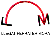
Brossa’s work - always simple but never plain - merits comment. At first sight, the bookplate seems to be two capital letters, F and M, joined together by an arrow that goes from one to the other. This is what it seems to be, but is not what you see. Brossa is a master at the art of simulation and revelation. In fact, the two ‘letters’ are not letters at all. Strictly speaking, what we see is: in the middle, an arrow curved like an arch; on the left, two black lines forming a right angle, where the arch begins; on the right, two parallel black lines that frame the head of the arrow. That is all there is. But once again Brossa reminds us that often we do not see what there is but what we know, and that even more often we do not know what we see.
In fact, nobody would say there is an F on the left if they did not see an M on the right. And no one would see the M if they did not seen the F. They are only visible because of the arrow. (The accompanying caption ‘Ferrater Mora Bequest’ provides a final hint for the most confused.) This is the magic of Brossa in action: two non-existent letters come into existence, simultaneously, in the arch of an arrow. The black lines become letters and then the initials of a name appear: Ferrater Mora. Brossa’s colors also play an important role: an orderly exchange between red and black. The thick red line of the arrow contains - and transports - small black specks, confirming that the arrow assumes the task of constructing the black letters we see at either end. If the black angle on the left gives birth to the arrow and the black lines on the right frame its head, the arrow - red but speckled with black - gives the black lines, on either side, their final meaning. The meaning of a letter. The meaning of a name.
I am sure that Ferrater would have been most pleased that such a forceful result has come about from playing with suggestion, exchange and transformation. He was always en route, in process, creating and recreating solid, rigorous and monumental work. Brossa never met Ferrater. But I am arrogant enough to think that to some degree I learned to appreciate Ferrater thanks to my explanations. In fact, this bookplate represents Ferrater Mora best, presenting him symbolically, as a simple, almost diaphanous arrow. An arrow that circles our cultural skies, that aims and hits its mark; but rather than threatening, it shelters.
(*) Article published in the Revista de Girona, no. 226, September-October 2004, p. 14